

IMAGES SIZES
Tips for Sizing Images on Your Site
Since the website editor focuses on making sure all sites are responsive, each time you upload an image, up to 5 reduced-size copies of the image are created. The site editor then automatically inserts the appropriately sized image into the desktop, tablet, and mobile to make sure your site visitors always see the correct sized image for their device.
Even though the editor resizes images automatically, it is important to know the basic attributes about the image you’re uploading to help ensure that the image will fit properly in the space in which you want the image to go on your site as well as to make sure you are using the best practices to keep your page load speed low. This site page goes over best practices using images on your site as well the standard image sizes for certain sections on your site.
Attributes to Consider
File Type:
The following image file types are supported (png, jpg, jpeg, gif, svg, svg+xml, ico, x-icon, webp).
File Size:
Image size should not exceed 15MB.
Resolution:
The total area of an image cannot exceed 3,145,728 pixels. It is unlikely any of your images will be over this limit, but you can quickly check by multiplying the pixel width by the height.
Color Mode:
RGB is the color mode used for all web materials. Do not use CMYK color mode on your website. CMYK is only for printed materials.
Figuring Out Your Pixel Width
Pixel Width Continued...
You can find your pixel width on an existing image on a site page or in the editor by clicking on the image.
From there you will see a popup the gives you the image name & size.
Images within the editor are shown as (pixel width x pixel height).
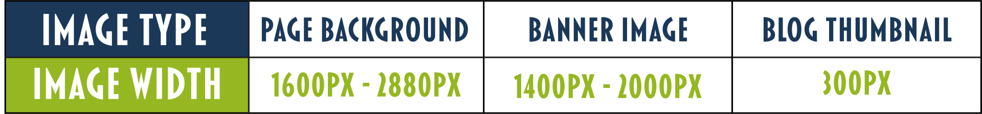
Image Sizing Guide: (Minimum Image Size)
Background images
- Use images at least 1600 pixels wide.
- For best results use images up to 2880 pixels wide.
Full-Width Images : Used for banner images or to fill a full width row.
- Image should be at least 1400 pixels wide.
- For best picture results use images up to 2000 pixels wide.
Half-Width Images : Used in one out of two columns in a row.
- Use images at least 700 pixels wide for the best quality.
1/3 Width Images: Used in one out of three columns in a row.
- Images should be at least 480 pixels wide for the best quality.
1/4 Width Images: Used in one out of four columns in a row.
- At least 360 pixels wide.
Small icons and logos
- At least 100 pixels wide.
Gallery images
- Lowest quality you will want to use in a gallery is a 200 pixel wide.
- For best page speed practices do not use images over 1500 pixels wide.
- The Photo Gallery widget is the most flexible widget to use with images, because there are so many layout options.
- The aspect ratio of images in the Photo Gallery should reflect how you want it to display.
- For example, square style galleries should have 1:1 ratio of images.
- Tall image style galleries should have longer height ratios, like 2:5, or 200px by 500px.
- The image ratios should be the same for design consistency. Leave some padding in the image to use the hover effect so that your images do not get cut off.
Image Quality Examples by Page Section
Image Specs
- Image Size: 1920x1280 pixels
- Image Type: jpg
- Horizontal image
Final Thoughts
The image above is a great size for a banner image. It does however create a panoramic style effect of the image which typically will work fine for a horizontal image.
Image Specs
- Image Size: 640x480 pixels
- Image Type: jpg
- Horizontal image
Final Thoughts
The image above is not suitable for a banner position. The image size is not large enough which has caused the image to stretch to a point in looks pixelated.
Tips for adding an image to a column within a row:
- when selecting an image to use within a column you should think about the amount of space (text, charts, buttons, etc.) you are filling in the other columns of the row. This helps keep your row proportionate.
- If you have a decent amount of items to include in your other rows, you may want to try using a vertical image.
- If you do not have many items to add to the column, you will want to use a horizontal image.
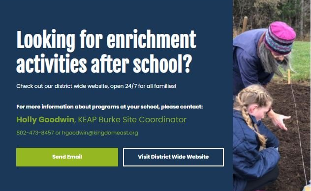
Image 1: Example of an image in a two column row

Image 2: Example of Poor Image Placement for the page space
Image 1 Notes:
- Due to the amount of items use in the row to the left we used a vertical image for this section.
Image 2 Notes:
- This is would best fit in a separate column instead of above the text.